YouTube Music’s New Look Is Rolling Out—Here’s What’s Changing

Earlier today we pointed out some changes that Google made to the Android variant of the Google Maps app. The changes were made to the Floating Action Button (FAB), the location button, and the Layers button. Now we can report on some changes being made to the icons found in the bottom bar of YouTube Music. A good example of what these changes are all about can be seen with the Home icon which has changed from being a simple design of a home to a slightly more complex design with a wider roof.
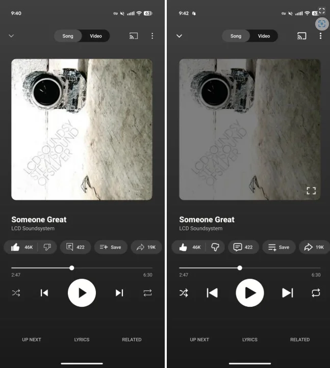
The thumbs up and thumbs down icons from the older design to the new updated look are quite different. The current, more realistic look was made with thin lines that included shirt cuffs; the newer version features thicker lines, and less realistic looking hands. In fact, all of the updated icons go from thin lines to thick lines. What this is supposed to convey to You Tube Music users isn’t exactly clear although the thicker lines make the icons look more modern than the ones drawn with the thin lines.
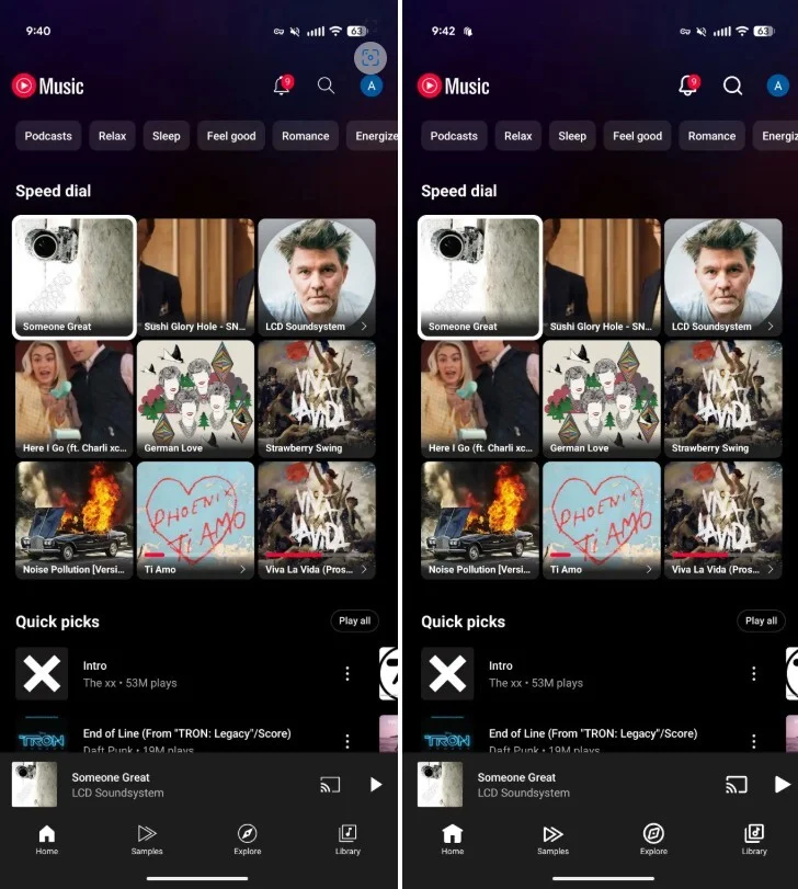
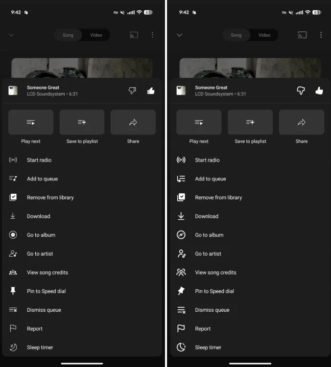
Using thin lines creates sharp, angular icons compared to the rounded icons that are created by using thicker lines. This can be seen in the Library icon which shows a musical note inside a box. The thinner lines of the box deliver a sharper look than the updated icon which uses a box created by the thicker lines. The updated icons seem to use empty space pretty well. A good example of this is the notification bell in the top right corner. The bell’s clapper on the new version of the icon makes use of an opening that is not filled in as it is on the older version of the icon.
You can really see the differences between the older and newer looks of the shuffle and sleep timer icons, and updated icons even make their way into the overflow menu. Look at the old and new versions of the Go to album icon. The updated version shows a reflection made from the grooves of the album. That is quite exquisite.
The new look has been rolling out on YouTube Music for Android, iOS, and on the desktop! So far, I have not received the updated version of the YouTube Music app for my Pixel 6 Pro running the latest Android 16 QPR2 Beta release, and my iPhone 15 Pro Max running iOS 26.1 Beta 1.


Comments are closed.